Good news – MasterPress 1.1 is now available for download!
The first major point release for MasterPress focuses on a complete UI overhaul to truly bring MasterPress in line with the flat design trend, and hence better align it with WordPress core. While we’d already taken some steps toward this in previous releases, this update adds a lot more polish. Let’s run through a couple of the great new features:
Icon font support for Post Types, Taxonomies, Field Sets and Fields
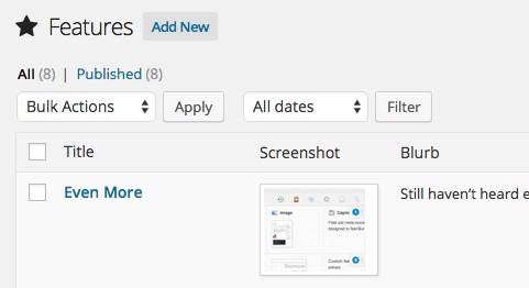
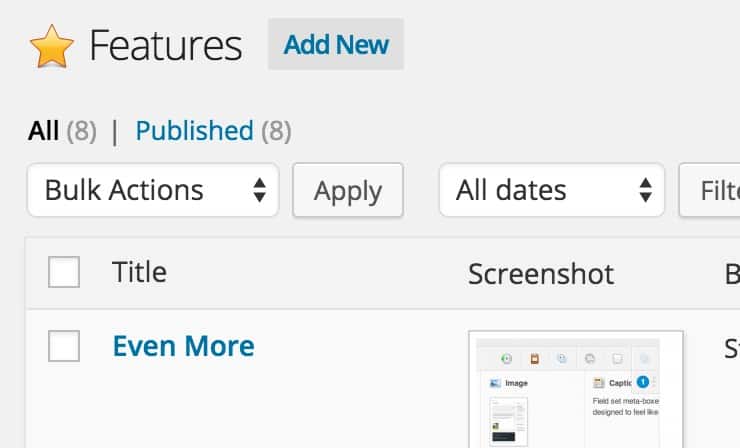
MasterPress now allows you to select icons for your post types from the Font Awesome and Genericons libraries! This is easily my favourite new feature, and is long overdue.
![]()
The icon you select will be applied right across the WordPress and MasterPress UI, and MasterPress continues to enhance the editing screens of your posts and taxonomy terms by adding a larger sized version of the icon adjacent to the title, giving your custom types more flair.
Note that we’ve gone to some length to ensure your existing bitmap icons still work correctly too. Support for these should in fact be even better now, as the uploader now allows you to upload icons which are larger in size than 16 x 16 pixels, which should render better on high resolution displays:
Font-based Icons throughout the MasterPress UI
We’ve gone through the entire MasterPress UI and replaced the (extensive number of) bitmap icons with web font vector icons. This really makes the UI feel fresh again, and of course making them vector based means that they now look fabulous on high resolution displays:
We’ve also added new custom designed icons for the title areas of list, edit, and creation screens throughout the UI, which also means they can now be colour-coded based on the action you’re performing. Slick!
Another welcome change is a completely new set of icons for the field types, built from the ground up to blend seamlessly with the current WordPress UI:
These have been carefully built to scale down beautifully both on standard and high resolution displays. Also, creating completely custom versions of these icons meant that we could tailor them to be a little more representative of their respective purpose.
I hope you enjoy the new release, and as always, that you don’t run into any major issues after the upgrade!

